
- Illustrator
- Hokyoung Kim
- Client
- The Atlantic
- Publication date
- May 15, 2026
Updated May 26, 2026

PUBLSHD
Updated May 26, 2026
A close look at how a single illustration works — its composition, the conceptual decisions behind it, the art-historical lineage it draws from, and the cultural moment it’s answering.

Paul Garland’s cover series for the Spring 2026 issue of RCSLT Bulletin is a slow reveal. The subject is frailty, and the butterfly is a natural metaphor. At first glance the cover reads as a peacock butterfly resting in cupped hands. Moments later something starts to shift. The patterns on the wings become speech balloons. The idea of speech and language therapy is built right into the creature’s anatomy. The cupped yellow hands underneath aren’t just holding a butterfly. They’re holding a voice. Frailty, communication, and care all sit inside one image, and the image waits for you to find them.



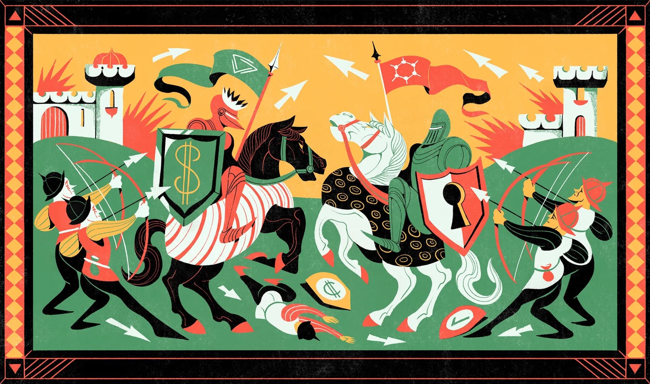
How a visual language inspired by a tapestry from 1070 captures a 2026 story about encryption keys
WIRED’s Big Story this week is a long profile about the bitter split between two developers behind GrapheneOS and its predecessor CopperheadOS. The feature illustration, by London-based Iain Macarthur, does not look like a feature illustration about a privacy-focused mobile OS. Two mounted knights clash in the center of a horizontal frieze, one on a black horse with a dollar-sign shield, the other on a white horse bearing a shield with a large black keyhole. A body lies face down between them. Two castles burn at either edge of the scene. Archers in the corners are loosing arrows at both combatants. The whole scene is contained inside a red-and-black heraldic border.