
Featured June 6, 2026
Brian Lutz used a pencil to reveal the life within Paul McCartney for Rolling Stone
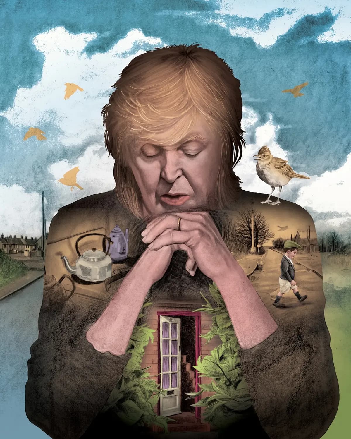
Eyes closed, head bowed, hands folded beneath his chin in a gesture somewhere between thought and prayer, this is Paul McCartney as illustrated by Brian Lutz for the Rolling Stone review of his new album. His dark winter coat opens onto the landscape of a Liverpool boyhood, pressed flat like the pages of a scrapbook. The concept reads in a second, but it keeps getting better, like a favorite record growing on you with every rotation. This is an image about what it feels like to carry your whole life inside you.
- Illustrator
- Brian Lutz
- Client
- Rolling Stone
- Publication date
- May 22, 2026