Owen Gent’s Eternally Dissolving Wuthering Heights for The New Yorker
- Illustrator
- Owen Gent
- Client
- The New Yorker
- Publication date
- February 9, 2026
Flirting with the Romantic sublime in a painterly take on Brontë's doomed love story
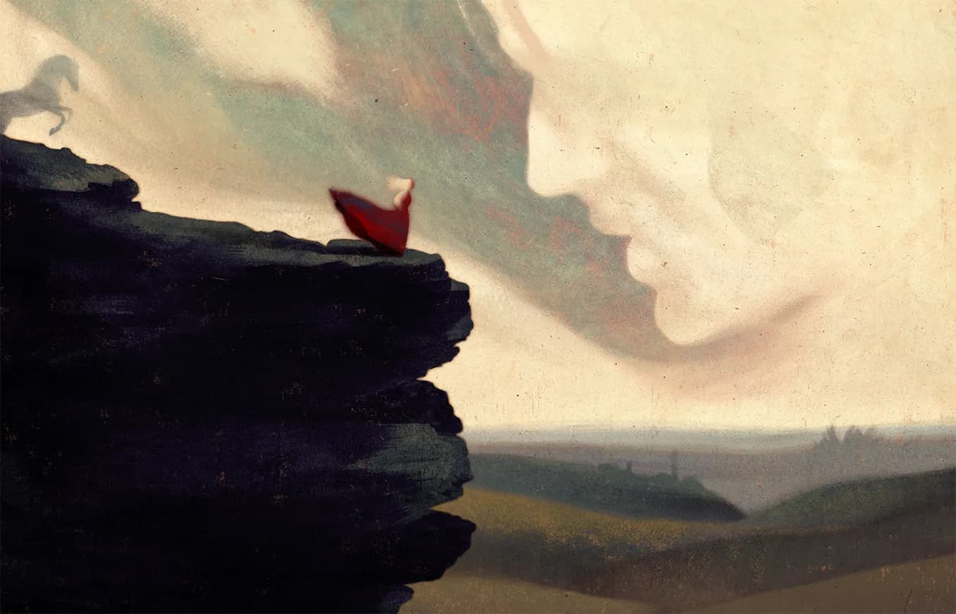
A tiny Catherine in red stands at the edge of a dark cliff, and above her, filling the sky, an enormous face leans down toward hers. They’re close, almost converging, but the distance between them is built into the composition itself. Heathcliff is everywhere in this image, inescapable, but he is unreachable. That’s the central tension in Owen Gent’s illustration for The New Yorker’s review of the new “Wuthering Heights” adaptation.
The composition references the Romantic sublime — Caspar David Friedrich’s lone figures dwarfed by vast, indifferent nature, Turner’s skies where light and atmosphere do all the emotional work. It’s a fitting art-historical lineage for Brontë, whose novel came out of that same tradition, and Gent uses it to get at something specific: the scale difference between Catherine’s small, physical reality and the enormous, borderless presence Heathcliff has become in her world.
The red dress is the only saturated color in a palette mixed from earth and dusk, pulling the eye to the one solid thing in a composition that’s eternally dissolving.