Julia Kluge illustrated twenty book reviews. What emerged was a single vision.
- Illustrator
- Julia Kluge
- Client
- FAZ
- Publication date
- March 14, 2026
A look at how one illustrator turned a full section of literary criticism into a cohesive visual experience
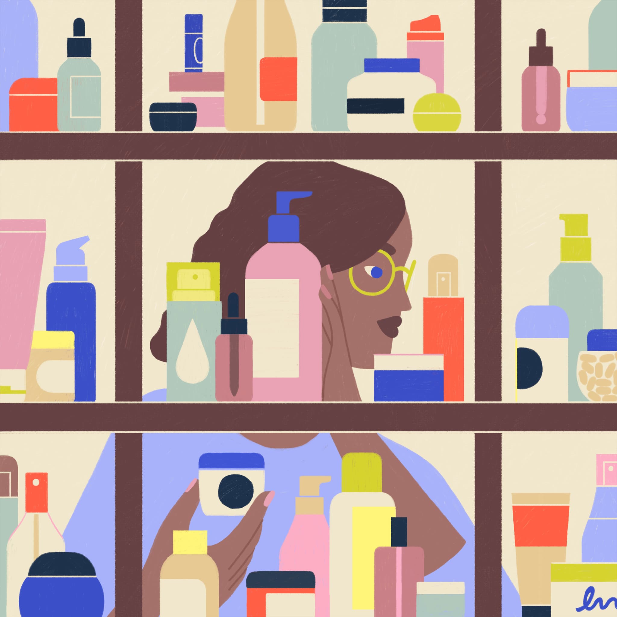
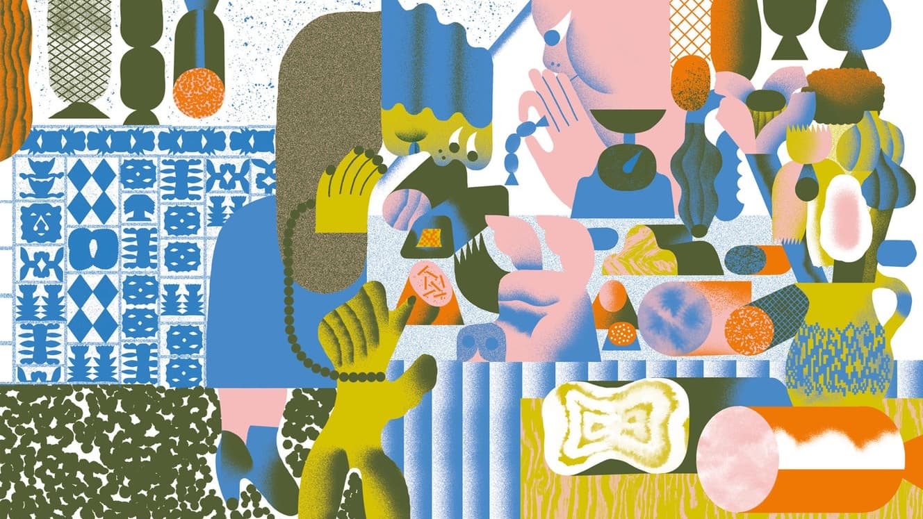
Readers of Germany’s Frankfurter Allgemeine Zeitung opened the newspaper’s celebrated Literatur supplement and found themselves surrounded by color. Across a full special section timed to the Leipzig Book Fair, twenty illustrations by Julia Kluge accompanied reviews of the season’s most anticipated titles. One artist threading an entire literary season together through her visual language.
Kluge has built a practice that sits between editorial illustration and artist’s books. She studied communication design at Burg Giebichenstein University of Art and Design in Halle under Georg Barber, the artist and comics maker known as ATAK, then completed a master’s in illustration at the Universität der Künste Berlin with Henning Wagenbreth. Her work carries Wagenbreth’s boldness of form but channels it through a warmer, more lyrical sensibility.
Her editorial work has appeared in The New York Times, Le Monde Diplomatique, Die ZEIT and Der Spiegel. Her illustrated book Wo dichte Äste wild sich ranken was recognized by the Stiftung Buchkunst as one of the twenty-five most beautiful German books of 2024.
Twenty Subjects, One Visual Language
Illustrating a single book review is a familiar editorial task. Illustrating an entire supplement is a different problem. Kluge had to create a set of images varied enough to honor subjects ranging from the history of the British East India Company to contemporary German poetry, yet consistent enough to feel like a single artistic statement.
She did it through formal consistency and thematic sensitivity. Her palette across the section favors bold, high-contrast color fields. Figures are simplified into graphic essentials that recall Fernand Léger’s geometric figures and the stylized heroes of mid-century poster art.
The Curatorial Gamble
The FAZ’s decision to give one illustrator this much space in a literary supplement is unusual. German newspapers have a long tradition of commissioning original illustration, and the Feuilleton pages of the major dailies remain a strong home for editorial art in Europe. But the convention tends toward variety, with different illustrators each bringing a different visual angle to complement the critic’s voice.
By handing the entire section to Kluge, the FAZ made a curatorial choice. The supplement became an exhibition as much as a review section. The visual point of view ran alongside the literary one, and the result strengthened both. Readers could move between reviews of wildly different books and still feel held inside a single aesthetic experience.
Illustrating What the Article Doesn’t Say
Kluge has described her approach as one of “adding a new layer to a text.” She doesn’t illustrate literally. She interprets. Her images are responses to the emotional and intellectual cores of the books being reviewed.
In the FAZ Literatur section, this approach found its ideal format. The oversized newspaper page, with its dense columns of German prose, provided the perfect canvas for Kluge’s expansive, color-saturated compositions. The illustrations created a visual atmosphere in which the act of reading felt charged with extra significance. They reminded readers that books are physical objects too, things with weight and texture that exist in the world beyond their narratives.
A City of People Who Still Believe in Paper
For Kluge, the commission also represented a kind of homecoming. The supplement was published to coincide with the Leipzig Book Fair, and Leipzig is the city she has made her base. Her illustrations, with their bold shapes and fearless color, feel entirely at home in a city whose visual culture has long been shaped by the graphic traditions of the Hochschule für Grafik und Buchkunst (Leipzig’s historic academy of fine arts) and the independent publishing scene that has flourished there in recent decades.
After the Last Page
Twenty illustrations in a single newspaper section may sound like a production feat. But what stays with you after turning the final page is the quality of attention. Together, Kluge’s images make the case that editorial illustration is still doing some of the sharpest visual thinking in publishing right now.
Free Illustration Newsletter
The newsletter is where we look at all of the newly published illustrations together to see what it all means.
Each issue is a human read on what’s being made, covering visual languages emerging, what’s getting commissioned, and what you may have missed.
Subscribe. It’s free.
We respect your privacy and never sell your data. Unsubscribe anytime.